
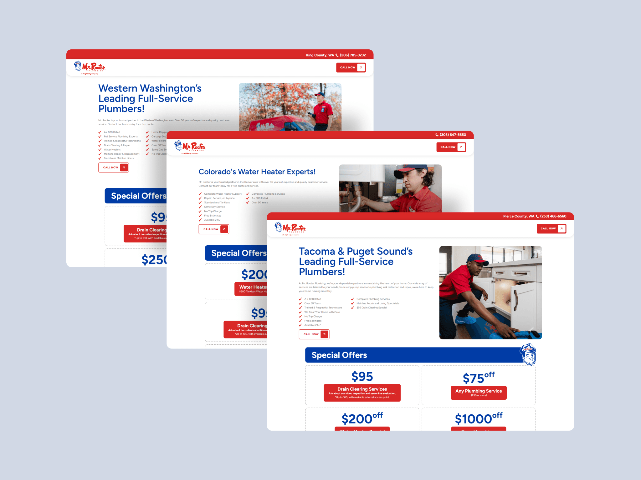
Mr. Rooter, part of the Neighborly family of brands, needed to expand into 8 new service regions without building 8 separate websites. I designed a scalable template system that could adapt to each region's services, offers, and testimonials while maintaining brand consistency and making it easy for non-technical staff to manage content. The goal was simple: drive more estimate requests in new markets.
Agency
LSM Works
Services
UX/UI Design Website Development
Industries
Home Services
Date
2025
My Role
I was the sole designer on this project and also led development end-to-end in Webflow. I worked directly with Neighborly stakeholders to define requirements and with individual franchise owners to understand their regional needs. I collaborated with LSM's dev team on location-based automations.
Understanding the Problem
Before jumping into design, I needed to understand two perspectives: the business and the end user.
From stakeholder conversations, I learned that previous regional expansions had been slow and expensive because each launch required custom design and dev work. Franchise owners also wanted autonomy to update their own promotions and testimonials without submitting tickets.
For the user side, I reviewed analytics from existing Mr. Rooter pages and looked at how competitors in the home services space structured their sites. The pattern was clear: users searching for plumbing services are high-intent. They want to quickly confirm you serve their area, see proof you're trustworthy (reviews, credentials), and request service with minimal friction. Anything that slows that down costs conversions.
The Challenge
The template system needed to solve for several tensions:
Local relevance vs. brand consistency: Each region had different services, offers, and testimonials, but the experience still needed to feel like one brand.
Marketing flexibility vs. design integrity: Non-technical staff needed to swap content easily without breaking layouts or creating visual inconsistencies.
Speed vs. quality: We needed to launch 8 regions efficiently, but each page still had to perform.

Design Process
I started by auditing Mr. Rooter's existing design system. Some elements like navigation and footers were already defined, but components for promotions, testimonials, and service cards needed to be created.
I used atomic design principles to break existing patterns into smaller building blocks. This let me create new components that felt native to the brand rather than bolted on. For example, the testimonial cards I designed used the same typographic hierarchy and color system as existing elements, just reconfigured for a new purpose.
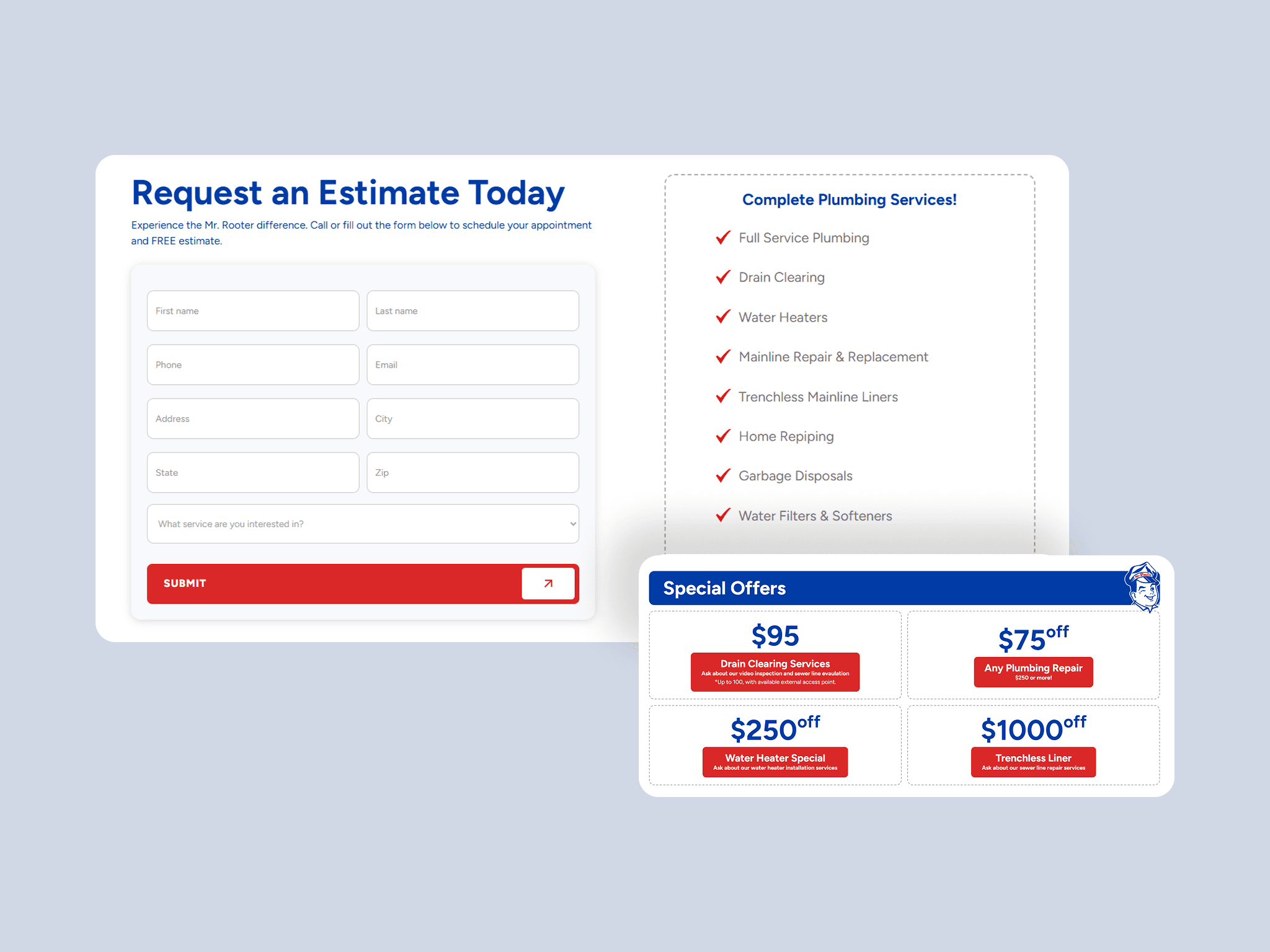
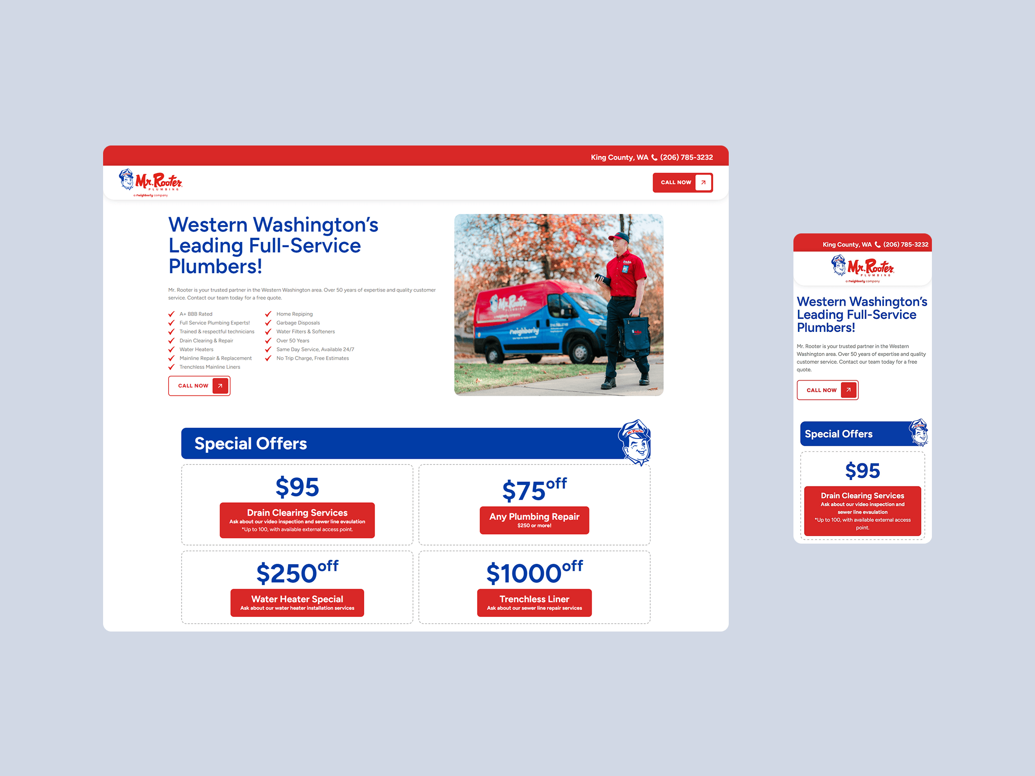
For layout, I created wireframe options exploring different approaches to information hierarchy. When I presented these to the client, I framed it as a conversation about priorities: what needs to be above the fold? How prominent should offers be versus trust signals? Franchise owners pushed for promotional offers to be immediately visible to encourage engagement. They also wanted the "Request an Estimate" form to be prominent since it was one of their primary conversion drivers. They initially requested more form fields to improve their internal reporting, but I pushed back to keep the form simplified and reduce friction for users.
I pressure-tested the template by populating it with content from different regions and service types. A region with 5 services and one with 12 needed to work equally well. This revealed edge cases, like how the layout handled services with minimal description text, which I solved by using flexible layouts that scaled automatically based on screen size and content length. I also created content guidelines for editors to ensure consistency and prevent layouts from breaking when new content was added.
Development and Implementation
I built the full system in Webflow with a CMS-driven architecture. Every piece of variable content, including services, testimonials, offers, and regional details, lives in the CMS so franchise teams can make updates without touching the design.
Mobile was a priority throughout. Analytics showed roughly 65% of traffic to existing Mr. Rooter pages came from mobile devices, so I designed mobile-first and ensured CTAs were thumb-friendly and forms were minimal.
For location-based personalization, I worked with the LSM dev team to implement Zapier automations that detect user location and serve relevant content automatically.
The Solution
Modular template system: Defined layouts that flex for different service counts and content types while staying visually consistent.
CMS-powered flexibility: Franchise owners and marketing staff can update offers, testimonials, and services without designer or developer involvement.
Streamlined conversion path: Simplified "Request an Estimate" forms and placed CTAs strategically based on user scroll behavior and intent signals.
Defined components library: New atoms and molecules that extended Mr. Rooter's design system for future use.
This project delivered a scalable design system that balanced consistency with personalization. By combining automation, dynamic content, and modular design, I empowered marketing teams to launch and manage regional pages efficiently. Users now encounter localized services, relevant offers, and seamless estimate requests within a trustworthy, branded experience.
Outcomes
Launched 8 new service regions with 40+ pages
200% increase in estimate inquiries across new service regions
Improved form conversion rate by 60% by simplifying fields and reducing friction
Enabled franchise owners to independently manage promotions and testimonials, eliminating designer/developer bottlenecks for routine content updates

