
Lonestar Streaming produces professional live events: conferences, sports, concerts, corporate keynotes. But they had no web presence to back them up. They were a new company trying to break into a space where credibility drives buying decisions, and without a digital home, they were losing deals before conversations even started. I designed and built their full marketing site from scratch, including a new brand identity, to give them something that could actually sell: a site that establishes legitimacy, communicates expertise, and converts visitors into inquiries.
Services
Brand Devlopment UX/UI Design
Industries
Media Production/Live Streaming
Date
2025
My Role
I was the sole designer and developer on this project, end-to-end. I worked directly with the Lonestar team on goals and content strategy, designed in Figma, and built the final site in Framer. That gave me precise control over animations, interactions, and responsive behavior across every breakpoint.
Understanding the Problem
Lonestar was a new company entering a crowded market with no portfolio, no brand, and no web presence. In a category where trust and track record drive decisions, that absence was expensive. Most competitors weren't setting a high bar: generic blue palettes, stock photography, bullet-pointed feature lists. For a new company with no name recognition, blending in wasn't an option. The site needed to do the work that a reputation couldn't yet do: create an immediate impression of quality and give prospects a reason to reach out.
The design direction followed from that. If the site felt premium, Lonestar would be treated as premium.
The Challenges
Trust without a track record: Every design decision, from typography to motion to visual hierarchy, had to contribute to a perception of authority the company hadn't yet earned through tenure alone.
No established brand: I had to build a visual identity from scratch before a single page could be designed, and it needed to be distinctive in a category full of forgettable aesthetics.
Premium feel without over-engineering: The interactions needed to feel polished and intentional, not gratuitous. A site that moved like a high-end product without getting in the way of the content.
Design Process
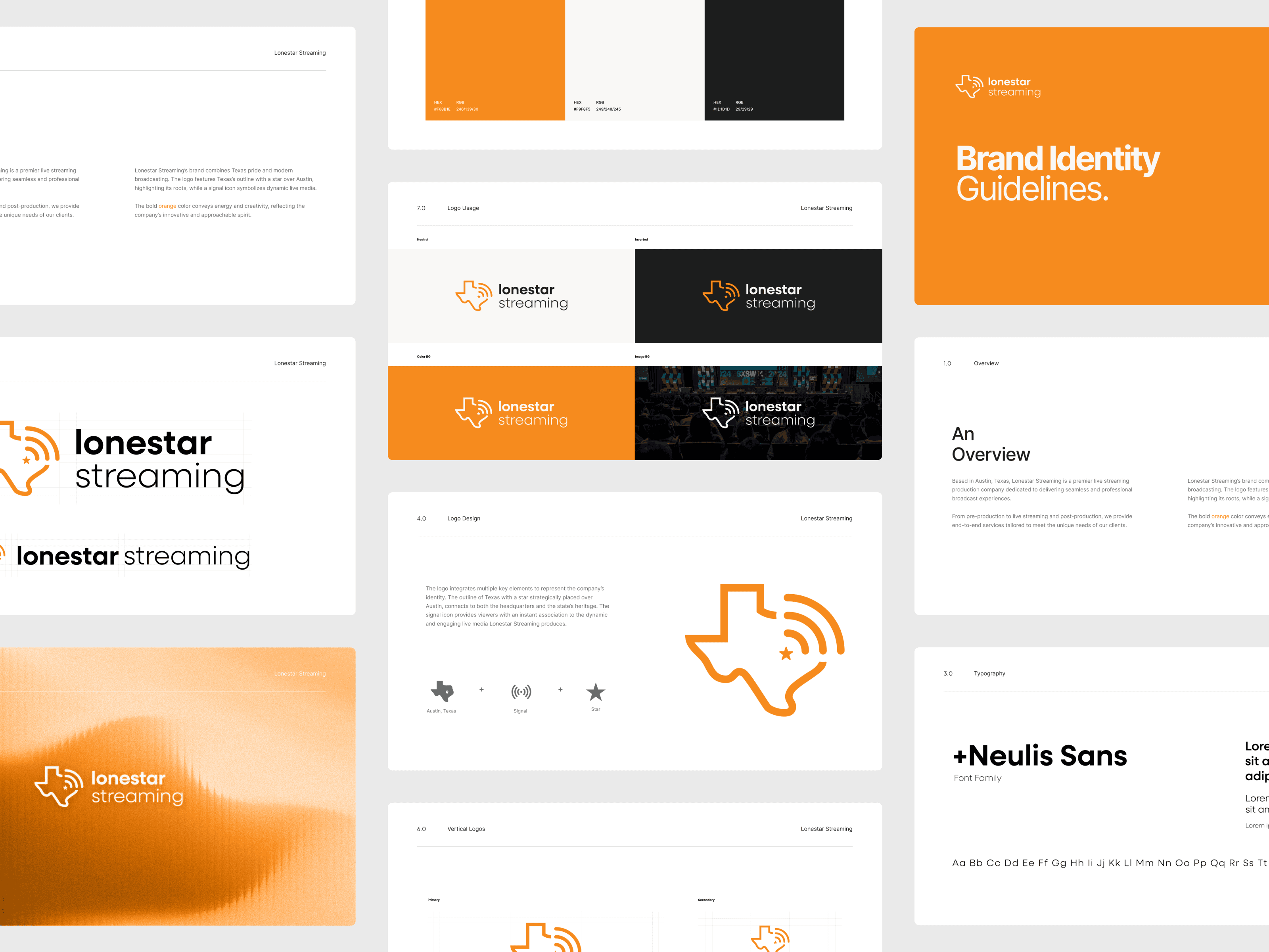
I started with brand before touching any layouts. Lonestar is Austin-based, so the identity needed a Texas anchor. I designed a logo combining the outline of the state with a star over Austin, paired with streaming signal iconography for immediate legibility. The color palette, primary orange against dark charcoal, was a deliberate move away from the blues that dominate the space. It reads as confident and energetic, and it set the tone for the cinematic aesthetic I was building toward.
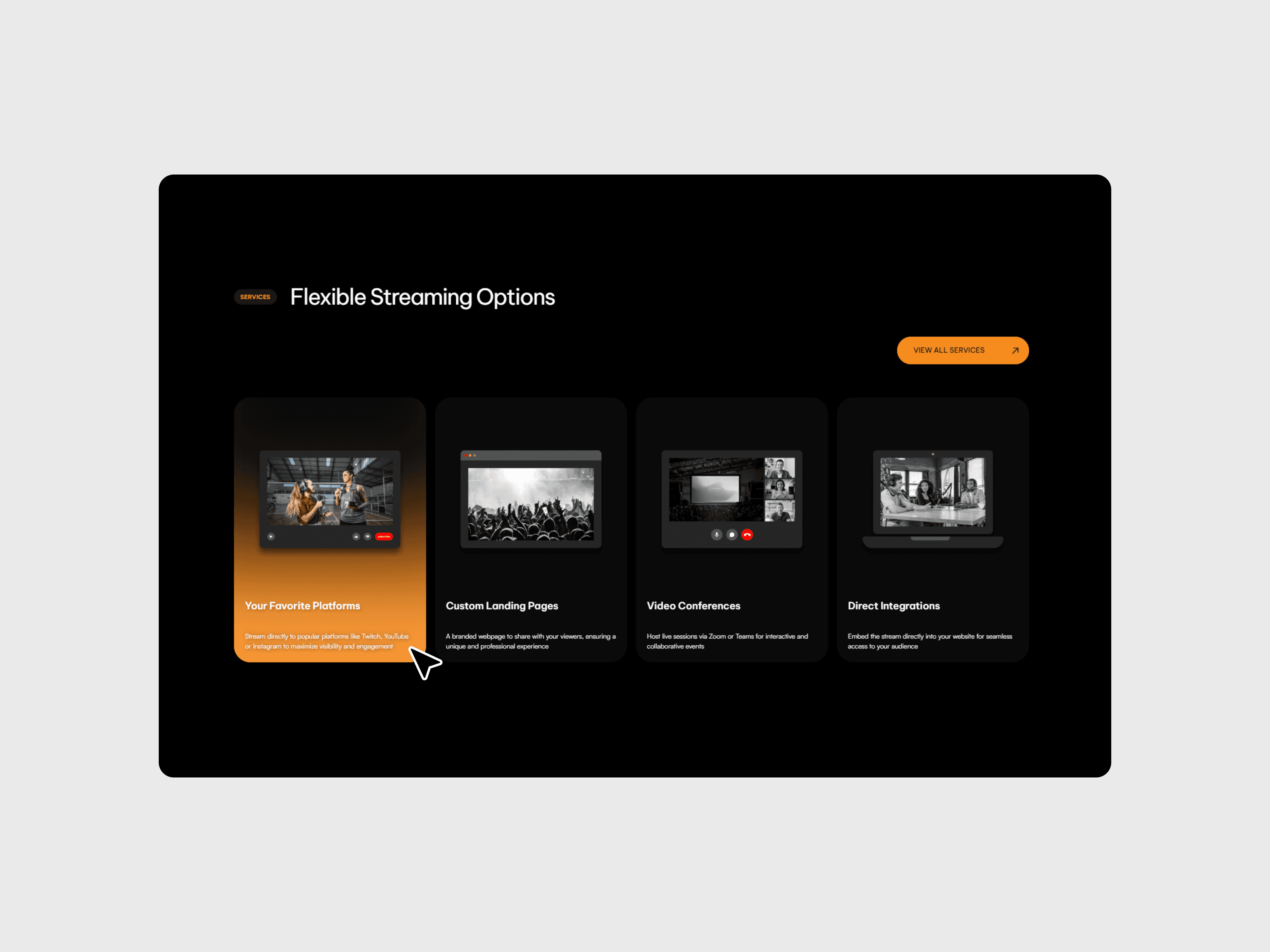
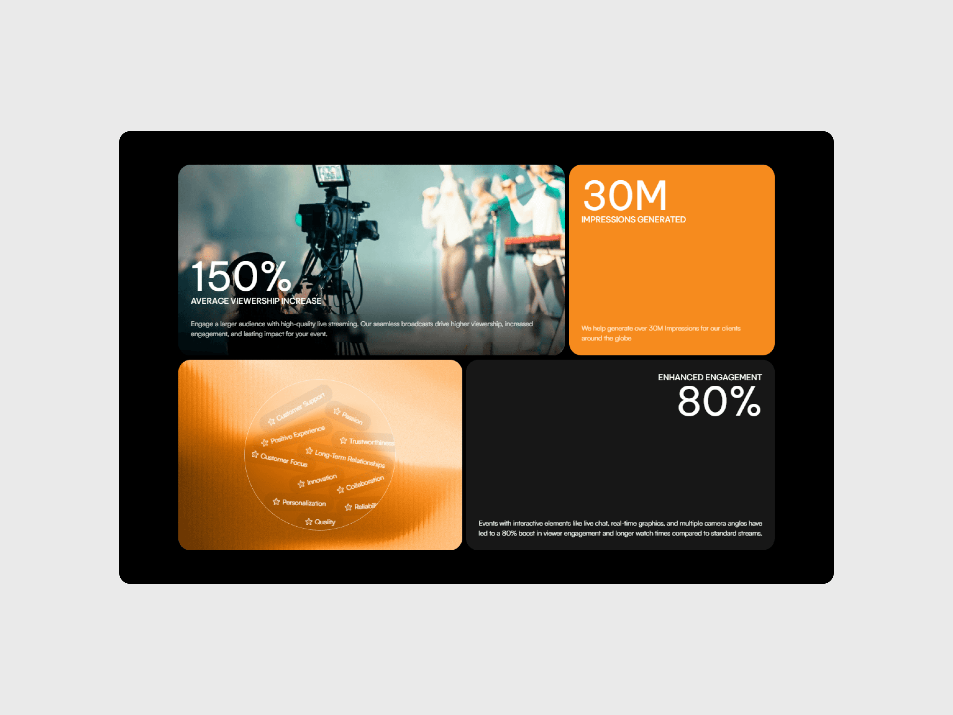
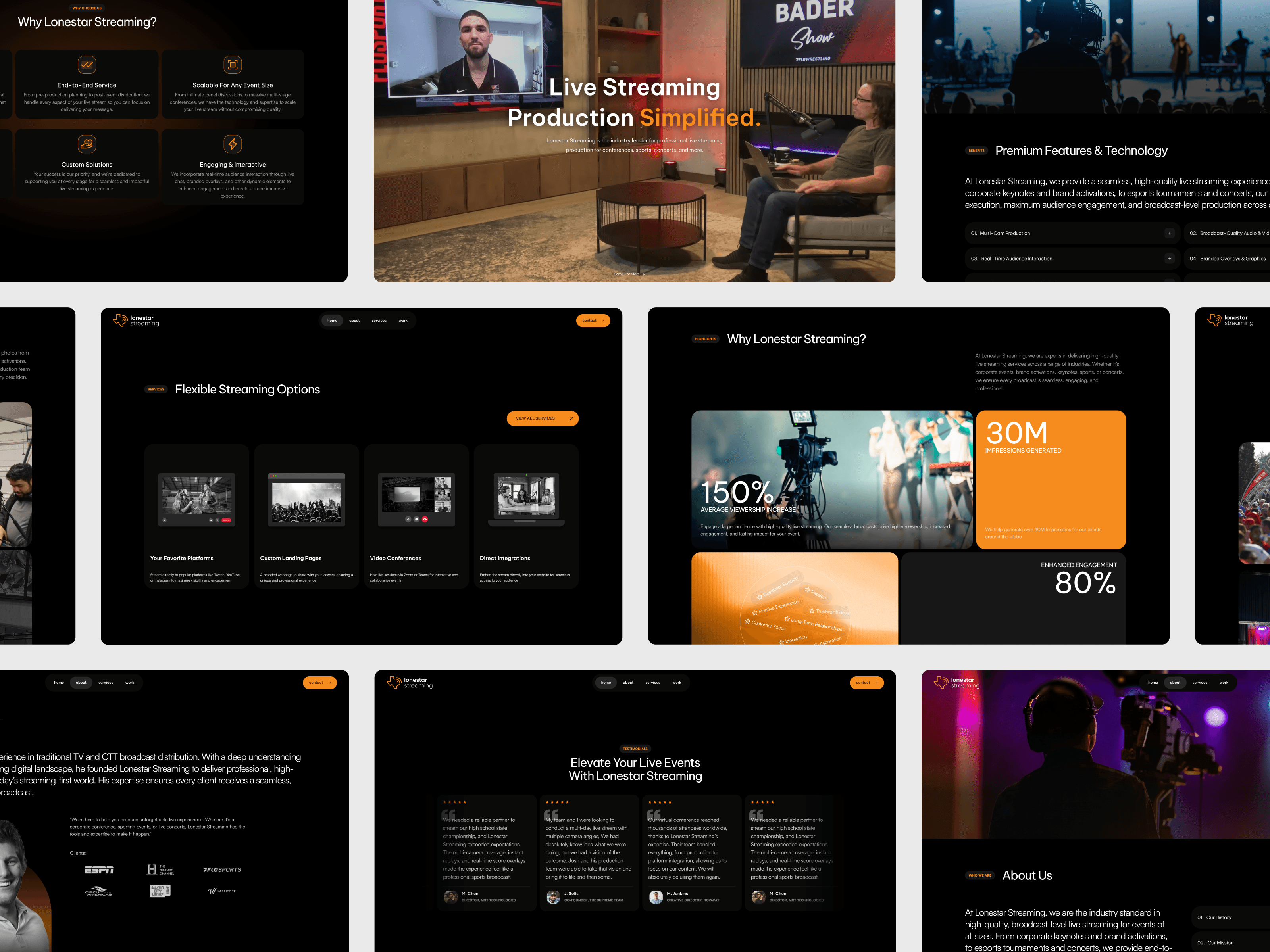
The homepage leads with a full-viewport video background pulled from their real event footage: live sports, concerts, corporate keynotes. The first thing a visitor sees is the actual quality of their work, not a description of it. Scroll-triggered animations bring each section in with precision, and hover states and micro-interactions throughout reinforce the sense that this is a company that sweats the details. Nothing animates for its own sake. The motion is there to give the page weight and build confidence as you scroll.
Client logos and case study previews featuring recognizable names, including Kansas City Chiefs, FloSports, and Varsity TV, appear early. For a new company, that social proof carries more weight than any copy, so I made sure those names were impossible to miss.
Responsive design was a priority throughout, not an afterthought. I designed for mobile and tablet breakpoints in parallel with desktop, ensuring scroll animations, video sections, and layout compositions held up across devices. CTAs stay prominent and thumb-friendly on mobile, and the overall hierarchy stays intact without the cramped, reformatted feel that happens when desktop-first sites get squeezed down.
The Solution
Full brand identity: Logo, color system, typography, and icon set built from scratch with a style guide for future use.
Premium motion and interactions: Scroll-triggered animations, cinematic video backgrounds, and intentional micro-interactions that reinforce Lonestar's production quality.
Responsive design system: Fully adapted layouts across desktop, tablet, and mobile with animations, video, and hierarchy intact at every breakpoint.
Conversion-focused structure: Client logos and case study proof points surfaced early, with visual hierarchy guiding prospects toward a contact form.
Framer build: Pixel-perfect translation of design to live site, fully self-managed by the Lonestar team going forward.

Conclusion
The biggest challenge on this project wasn't designing a good website. It was designing one that could stand in for a reputation that didn't exist yet. Every decision, from the brand identity to the motion design to the content hierarchy, was made with that constraint in mind. The result was a site that felt like it came from a company with years of experience behind it, which gave Lonestar the credibility to compete for clients they wouldn't have had a shot at before. It's also a reminder that for early-stage companies, design isn't just aesthetic. It's a business asset.
Outcomes
Tripled qualified leads and demo requests within the first month of launch
New clients directly cited the branding and website as a factor in their decision to reach out
Established Lonestar's market presence from zero, enabling them to win enterprise clients within months of launch

